Wednesday, 18 April 2018

OUGD602 | Personal & Professional Practice 3 | Self branding Reform - Development - Stickers & Poster designs

Self Branding Sticker Designs
Below are the sticker experiment of the 'Sung' logo designs. 


Original logo design

Chinese Character in three different colours
Three Coloured Background and White Logo


Sung Poster Designs
Beneath is the final poster design of the 'Sung' logo design. The size of the poster is A3 preferably printed in a glossy quality.


Printed versions of the Poster and Sticker designs
These are the finish self branding 'Sung' posters and sticker designs printed. The poster design was printed in a glossy A3 sheet the colours turned out very well. 

The sticker designs were printed on a see-through stick sheen. I originally wanted it on a white matte colour sticky sheet, however due to technical support in the digital printing room the technicians were not able to get the sticker cutter machine to work. They then advised me to use the see-through sheet has the around sticker outline will not be visible when cut out. Therefore due to this advise, I printed on the sheet that they suggested. The outcome of the sticker design looks decent but if looked closely it is obvious that it has been cut out by free hand and the outline of the circle edge is still visible. The other complication of the sticker design is that the colour grey on the logo design is not as visible compare to the other single coloured sticker designs. This is a reason why my initial idea of printing them on a white matte sheet is more suitable for the lighter colours to stand out. 

Below are images of the printed versions: 

Final A3 print of logo design

Final product of self branding stickers

Sticker designs on Macbook Pro


Tuesday, 10 April 2018

OUGD602 | Personal & Professional Practice 3 | Self branding Reform - Development - Patterns & Business card designs

Final New logo design
Below are the final logo design for the new 'Sung' self branding identity logo. Additional shadows of the logo coloured white and blue (Consist from the colour scheme) were added to make the logo look 3D. And the information of what kind of designer I am was written in the typeface 'Futura'. Despite Graphic design to be my main major, packaging design is of a particular interest to me, as I wish to work and further develop within this area. However, I am not 100% specialised in this area therefore it will not be added in until I do have prior experience. The gold colour is used to full in the white circles and letters that include a circle, this is an ongoing theme for my logo design. 


Development - Logo Pattern designs
To rephrase the connection between the new logo design and how it associate well with the typeface 'Futura medium'. Due to the logo and Futura typeface are both designed in a geometric style. Futura is geometric sans-serif typeface designed by Paul Renner. Especially how the typeface is based on geometric shapes, especially the circle shape, this is similar to the new logo having circular aspects. 

Thus the pattern theme designs must be able to relate to the new logo design as the concept of geometric shapes will be similar to the logo and typeface design. The following patterns experimentations of geometric shapes such as circles, hexagons, circular stars and so one will be tested with the new 'Sung' logo design.  

Selection of Pattern designs
Underneath are pattern designs combined with the 'Sung' logo design. This has been tested out to see which pattern theme suits the circular geometric concept. 


A mixture between gold circles, blue hexagons and grey circles has been experimented with.
This pattern choice is not an adequate design as it distracts the main logo design.

A mixture between gold circles, and the blue circles outline has been experimented with.
This pattern choice is not an adequate design as the gold circles distracts the main logo design.

The gold circles being the main pattern design with the logo has been experimented.
This pattern choice is not an adequate design as the gold circles still distracts the main logo design.
A mixture of blue and grey circle outlines has been experimented with.
This pattern choice is more adequate to the design due to the concept of using geometric shapes is consistent.

A mixture between blue hexagons, and the grey circles outline has been experimented with.
This pattern choice is not an adequate design due to the size of the hexagon and
circles will distract the main logo design.

Final Business cards designs
Below are the final designs for the 'Sung' self branding business cards. The circular the,e is consistent, sophisticated and appealing. Mock-ups of business cards have been produced. 

'Sung' front business card design

'Sung' front business card design

Mock ups of Business cards


Final Printed Business card designs


Monday, 9 April 2018

OUGD602 | Personal & Professional Practice 3 | Self branding Reform - Typefaces & Colour scheme Development

Typeface - Self Branding logo
Beneath is the main typeface for the new self branding colour scheme. The typeface used is 'Futura medium', for my previous self branding logo 'Futura regular' was also used as the main typeface and logo of the self branding known as 'Beyond'. The reasoning of this remaining is that my logo is designed in a geometric style, this is similar to the creation of the 'Futura' typeface. Futura is geometric sans-serif typeface designed by Paul Renner. It was designed as a contribution on the New Frankfurt-project. It is based on geometric shapes, especially the circle, similar in spirit to the Bauhaus design style of the period.


Logo Colour Scheme Experimentation
Below are a selection of the three different logos tested with the main colour scheme. From this colour experimentation can assist which colours are the best for the whole body of the logo or the other areas. Majority of them work well with one another, however, the colour silver of the main logo had more positive feedback especially when rotated into a Chinese which is my surname 'Sung'. 

The two other logo designs were not as positive compare to the 'Chinese Character - Sung' 
Firstly the second row of the logo design, there was a lot of different colours contrasting against one another making the logo design becoming chaotic and unharmonised. Whilst the first row logo design, the letter 'S' was not as recognisable compared to the letter 'K'. Majority of the feedback from peers said that the top row logo looks like a 'Chinese Character' when given a first glimpse. Therefore, it was evident that the Chinese Character logo should be my new self branding logo design.  


Experimentation of Colour Schemes


Comparison draft to explain how the logo became to the final design

Monday, 2 April 2018

OUGD602 | Personal & Professional Practice 3 | Self branding Reform - Vector designs & Colour Scheme

Illustrator Vectors of logo designs
After deciding which sketches to vectorised in Adobe Illustrations for the new self branding logo. Below are the two most promising designs that can be used in a professional manner to convey my self identity. 


The vectorised logo sketches were drawn and digitalised on Illustrator. The first set of these designs that are still in need of improvement. For the first vector design having combining the letter 'S' and overlapping it with the letter 'K' was experimented. However, the feedback that was received from the first vector design, majority stated that the letter 'k' does not look very proportional especially the bottom part of the edge of the letter 'k' and the bottom curve of the letter 's'. 

Whilst the other vector design after examining the sketch design, it looked very empty in the middle of it, when scanning the vectorised sketches and having a secondary look at it. The design became similar to Chinese Character after adding the addition line in between the letter 'K'. Therefore this kind of design looks like a logo if rotated the other way round. The feedback given for the second design was very positive as many could tell it looked similar to a Chinese Character. But many of my peers asked to see the outline of second vector design. 

Secondary logo vectors - outlines
Underneath are the secondary logo vectors of my self branding logo. More experimentations was developed onto the previous vector design; testing out the thickness or thinness of the logo, rounder and smoother edges. In addition, after another observation of the logo when turned it began to look like my surname Chinese character known as 'Sung' which in Chinese is written like '宋'. For the top hat stroke had to be replaced by a circle as if a stroke was added on the top, the logo will look unbalanced. 

Chinese Character Surname - Song/Sung


By having the option of being able to rotate the logo design, one can be used for the English logo and the other when rotated an international logo. Nevertheless both types of vectorises logos will be tested with the chosen colour scheme. 

These examples are shown below:


New colour scheme
When deciding for either using the same previous colour scheme or creating a new one for the new self branding logo. Inspiration from the previous self branding logo design colour scheme some aspects of it was used for this design. Mainly the colours of metallic silver, gold and white. The only colour change was the blue as before was a dark royal blue, however for the new logo has turn into a light colour blue. 

This colour scheme will be tested on the two new vectorised logo design for further experimentation. 


Friday, 30 March 2018

OUGD602 | Personal & Professional Practice 3 | Self branding Reform - Initial Sketches

Third Year - Initial Sketches of New Self Branding logo
By using the First year previous sketches and designs of the 'KS' self branding logo to further develop and expand the meaning of my self branding design. To reiterate the ideal logo that I wanted to produce was to unite or blend the two letters 'K' and 'S' together. This part of the logo design was the most challenging aspect of the design process. 

The reasoning of this is that majority of the combined logo designs from other designers initials of their name are all letters that have straight edges. These straight edges are easier to merge to one another, comparison to the initials in my name the letter 'K' is more straight whilst the letter 'S' is more curve. These types of letter shapes are more challenging to combine therefore lots of trial and error sketches were made. 

Below are the sketches: 


Wednesday, 28 March 2018

OUGD602 | Personal & Professional Practice 3 | Self branding Reform - Previous design (Beyond)

Previous First Year Self branding design - 'KS' and Beyond
At the beginning of first year of University, I began to do my first attempt of my self branding logo design which were based on my forename and surname initials which are 'K' & 'S' to make Katie Sung. This previous logo design's concept was to imply what kind of a designer I would like to be. For instance, the imagery idea of the two initial letters to supposed to be a star. The star semiotics was to portray that I am an individual and designer which its still developing, so therefore each time I learn a new skill. I will alter and change my logo design thus becoming something completely new. 

Nevertheless, during the development stages of my first self branding design started to change my logo design. The reasoning of this is that I did not like the combination of my initials together nor my name being used as my identity. Therefore, I started thinking about my journey how my art style has changed over the pass years in high school, college and now University. This involved me looking back at my old work and see the slight or massive changes that has effect it. For example: my old work is very cartoony, colourful and imaginative. Now it has tone down to a more simplistic, mature, informal and sophisticated as I start growing up and becoming more like an adult. Thus using the work ‘Beyond’ conveys how much I have changed and exceed my expectations by the work I have produced over the first year in University.

Below are the sketches and digital designs:


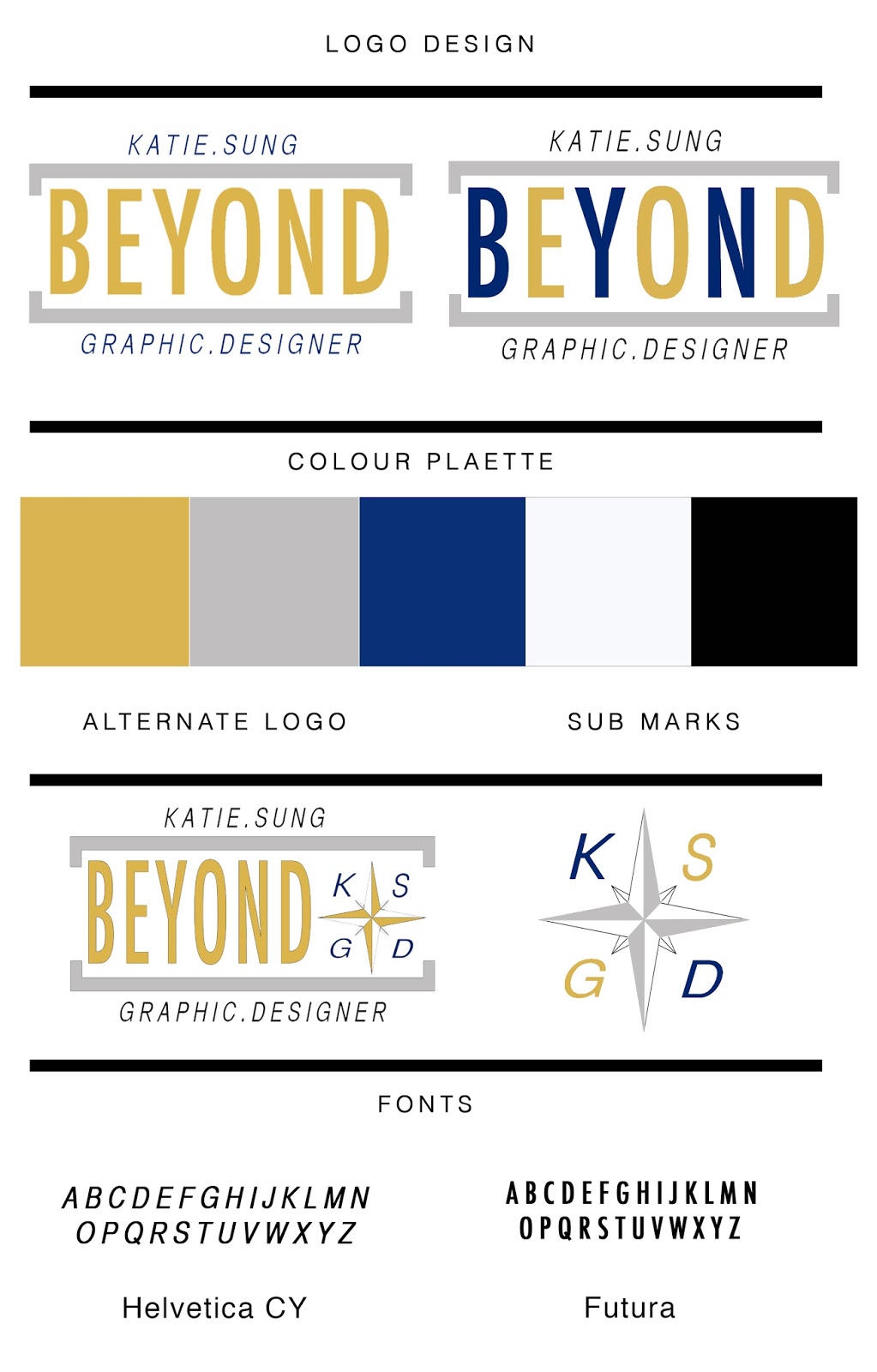
Below are the digital design development and final design for the 'Beyond' self branding concept, the colour schemes and font choices. The first colour scheme were: gold, silver, dark blue, white and black. The reason for this is because the colours that I have chosen represent me as an individual, for example the colour Gold shows my success, achievement and triumph. Associated with abundance and prosperity, luxury and quality, prestige and sophistication, value and elegance, the colour psychology of gold implies affluence, material wealth and extravagance. Silver highlights a feminine energy; it is related to the moon and the ebb and flow of the tides - it is fluid, emotional, sensitive and mysterious. Blue presents of trust and peace. It can suggest loyalty and integrity as well as conservatism and frigidity. White coneys its most complete and pure, the colour of perfection. The colour meaning of white is purity, innocence, wholeness and completion. And black symbolises is the colour of the hidden, the secretive and the unknown, creating an air of mystery. It keeps things bottled up inside, hidden from the world. But overall it is portrays me me being like a star (concept). 

Whereas the typefaces that are used were 'Helvetica CY' and 'Futura' as they have that  modern, clean and simple style. Reasoning of this type of typeface for my Self branding logo is that Helvetica - It's over 50 years old, it is the most widely used font ever, and has become the subject if its own movie. This is the world's most recognisable font. Futura has many variations of thickness, thinnest and so on. Futura remains one of the most used (and loved) sans-serif fonts today with no signs of slowing down.


Final design to showcase my First Year Self branding logo
The final design of the 'Beyond' logo and product of my self branding that was produce was a travel kit concept, this product was to imply to my audience that the designer that I wish to be in the future is the one that travels and demonstrates a journey of being a Graphic designer - specifically over the course of university.  

The main target audience for this logo was aimed at First year students who are about to start their University course. This logo will enable the potential audience to relate and connect to the branding. In addition, the overall logo design and product depicts me as a designer and an individual. 

Below are the final products for the self branding these are a small like A5 concertina bind travel journal which its purpose is to communicate/record the journey of developing as a designer/individual. Foiling productions were also exacuted for the product design as it was to highlight my colour scheme. The foiling production is not 100% as it demonstrates that being a novice design is still in development.  


Evaluation
Overall, this primary design of the self branding logo and final product was successful but was not the idea logo that I would like to further develop nor distribute online as my final self branding logo. I preferably like my logo to consist of the first and last name of my initials and to try to combine the two letters together to make a shape or a symbol/icon. Similarly to other current self branding logos online. Therefore further growth will be experimented on the previous first sketches of my initial logo to something which I am proud to show and distribute to a wider audience. 

Thursday, 22 March 2018

OUGD602 | Personal & Professional Practice 3 | Placement Email - Responses, Rejections and Disregard

Below are the list of agencies and firms that I emailed and the response, rejections and disregard reply. I may try and email these agencies/firms again. 

List of Design firms and Agencies response:

Manchester
  1. 999 Design – no reply 
  2. Thinkdesignagency – no reply 
  3. Gorillastudio – no reply 
  4. Bgn.agency – replied not taken internships this year 
  5. Dcp-uk – no reply 
  6. Renfrewcreative – no reply 
  7. Cubecreative – no reply 
  8. Ahoy – no reply
  9. Loaf – replied contact if they have anything free 
  10. Dinosaur – no reply 
  11. Refinerygroup – no reply 
  12. Creative sparks – no reply 
  13. Rainbow - waiting for response
London
  1. Digital light ltd design – no reply
  2. Tough little graphics – replied no office cannot offer placement 
  3. Design happy – no reply 
  4. Maydaylondon – replied not taking placement this year 
  5. Spinach design – no reply 
  6. Pearlfisher – no reply 
  7. R design – replied, sent portfolio and replied if they want an interview with me. 
  8. Marmalade London design – replied someone has taken it 
  9. Gloriouscreative – no reply 
  10. Love creative – No reply 
Leeds
  1. Robot food – no reply 
  2. Lord Whitney - reply not taking internships
Email response from agencies that have contacted back:
Underneath are the some of the agencies that have contacted back to inform me that they are not taking creative internships this year or they have already accommodated someone else. The 'R Design' agency admin replied if they liked my portfolio work they will contact back and request to interview me. Unfortunately I did not have a following email for this potential interview and internship.